
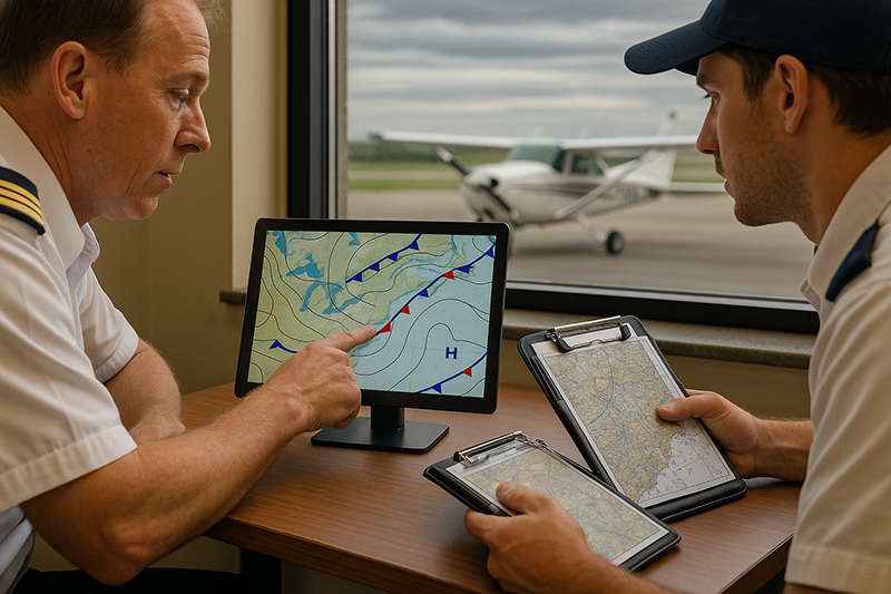
Surface analysis charts give pilots a big-picture view of aviation weather by showing pressure systems, fronts, troughs, and other major surface features across a wide geographic area. Before focusing on individual METARs, TAFs, radar images, or winds aloft forecasts, a pilot can use the surface analysis chart to understand why the weather is behaving the way it is. That larger context often makes local conditions easier to interpret and future changes easier to anticipate.
For student pilots, surface analysis charts can feel abstract at first. They are not airport-specific forecasts, and they do not directly tell you whether a particular runway will be VFR or IFR at your planned arrival time. Their value is broader. They help you see the structure of the weather system affecting your route: where the air masses meet, where pressure gradients may drive stronger winds, where frontal lifting may support clouds and precipitation, and where changing conditions may arrive sooner than expected.
For instructors, dispatchers, aviation managers, and experienced pilots, the chart is a practical decision-making tool. It supports better weather briefings, sharper go/no-go judgment, and more meaningful conversations about alternates, fuel planning, routing, turbulence potential, and changing ceilings or visibility. Used properly, it turns scattered weather observations into a connected story.
What a Surface Analysis Chart Shows
A surface analysis chart is a weather map that depicts analyzed surface weather features at a specific time. It typically shows pressure patterns, isobars, high- and low-pressure centers, fronts, troughs, and sometimes other boundaries or significant surface features. The word “analysis” is important. The chart is not simply a raw observation. It is a meteorological interpretation of surface weather data, assembled to show the current structure of the weather system.
The most obvious features are pressure centers and isobars. A high-pressure center is usually marked with an “H,” while a low-pressure center is marked with an “L.” Isobars are lines connecting points of equal sea-level pressure. When the isobars are packed close together, the pressure changes rapidly over a shorter distance, which usually indicates a stronger pressure gradient and stronger surface winds. When the isobars are widely spaced, winds are generally lighter.
Fronts appear where contrasting air masses meet. A cold front marks the leading edge of advancing colder air. A warm front marks the leading edge of advancing warmer air. A stationary front indicates a boundary that is not moving much. An occluded front forms when a faster-moving cold front overtakes a warm front, creating a more complex boundary often associated with mature low-pressure systems. A trough is an elongated area of relatively lower pressure and can be associated with wind shifts, cloud development, precipitation, or unsettled weather even when a formal front is not drawn.
The chart is usually valid at a specific analysis time. That means it is a snapshot of the atmosphere at the surface, not a complete route forecast by itself. A surface analysis chart is most useful when it is compared with current observations, forecast products, radar, satellite imagery, winds aloft information, and pilot reports when available.
Pressure Systems: The Framework Behind the Weather
Pressure systems help explain the broad motion of air near the surface. In the Northern Hemisphere, air generally circulates clockwise and outward around surface high-pressure systems, and counterclockwise and inward around surface low-pressure systems. Near the surface, friction causes wind to cross the isobars somewhat rather than flowing perfectly parallel to them. This is why a surface wind direction may not match the exact orientation of the isobars, especially near terrain, coastlines, and local friction influences.
High pressure is often associated with sinking air, which can limit cloud formation and produce more stable weather. However, high pressure does not automatically mean perfect flying weather. Moisture trapped under a stable layer may produce haze, low stratus, fog, or poor visibility, especially overnight or in the morning. In winter, strong surface highs can also be associated with very cold temperatures and density-related performance considerations. Pilots should avoid turning the “H” on a chart into a simplistic guarantee of smooth, clear, unlimited visibility conditions.
Low pressure is commonly associated with rising air, convergence, cloud formation, precipitation, and more active weather. Around lows, pilots may find stronger winds, shifting wind directions, lower ceilings, precipitation bands, and embedded convective activity depending on the season and air mass. A low-pressure system also tends to organize fronts, which can create distinct zones of weather along and ahead of the boundaries.
The distance between isobars matters. A tight pressure gradient often points to stronger surface winds and potentially mechanical turbulence, crosswind challenges, or wind shear near terrain or frontal zones. A broad, weak pressure pattern may suggest lighter winds, but it may also allow local effects such as sea breezes, valley winds, fog formation, or convective outflows to become more influential. The surface analysis chart provides the background pattern, but the pilot must still evaluate airport-specific wind, runway alignment, terrain, and time of day.
Fronts: Where Weather Changes Become Operational
Fronts are among the most important features on a surface analysis chart because they identify boundaries between different air masses. Weather often changes most rapidly near these boundaries. For pilots, that matters because frontal passage can bring wind shifts, gusts, changing ceilings, changing visibility, precipitation, turbulence, and sometimes thunderstorms.
A cold front is typically shown with triangular symbols pointing in the direction of movement. Cold fronts can be associated with a relatively narrow band of active weather, especially when warm, moist, unstable air is lifted ahead of the advancing colder air. Depending on the environment, a cold front may bring showers, thunderstorms, gusty winds, turbulence, and a significant wind shift. In other situations, a cold front may pass with only a line of clouds and a noticeable temperature change. The chart tells you where the front is located, but other products are needed to evaluate intensity.
A warm front is usually shown with semicircles pointing in the direction of movement. Warm fronts often have a more gradual slope than cold fronts and can produce widespread cloud layers and precipitation over a broader area ahead of the surface boundary. For pilots, warm-front weather can be operationally significant because ceilings and visibility may deteriorate over a large region. Low stratus, mist, steady precipitation, and embedded instrument conditions can extend well ahead of the front.
A stationary front uses alternating cold-front and warm-front symbols on opposite sides of the boundary. It indicates a frontal zone with little net movement. Stationary fronts can be especially important for flight planning because weather may persist in the same general area for an extended period. That persistence can affect fuel planning, alternates, training schedules, and the likelihood that conditions will improve before a planned departure.
An occluded front uses combined cold-front and warm-front symbols on the same side of the line. Occlusions are commonly associated with mature low-pressure systems and can bring complex cloud and precipitation patterns. A pilot should treat an occluded frontal region as a sign that the weather pattern deserves careful review, especially for longer cross-country flights or operations near marginal conditions.
Why This Matters in Real-World Aviation
In real-world aviation, a pilot rarely makes a good weather decision by looking at one airport report in isolation. A METAR can describe what is happening at a particular airport at the observation time, and a TAF can forecast conditions for that airport. But the surface analysis chart helps answer a deeper question: what weather system is causing these conditions, and where is it moving?
That context is important for route selection. A pilot planning a VFR cross-country might see acceptable conditions at the departure airport and destination but notice a cold front lying across the route. The chart raises questions that must be answered before launch. How fast is the front moving? Are ceilings lowering ahead of it? Is precipitation developing along it? Are winds behind the front stronger than expected? Would a route farther north or south reduce exposure to the frontal zone?
For instrument pilots, the chart is equally useful. IFR flight allows operation in clouds when properly equipped, rated, current, and cleared, but it does not eliminate weather risk. Frontal weather can increase workload through turbulence, icing potential in suitable temperature and moisture conditions, embedded convective activity, changing winds, and approach minimum considerations. A surface analysis chart can help the pilot recognize whether the flight is part of a broader deteriorating pattern rather than a simple local ceiling issue.
Flight instructors can use surface analysis charts to teach students how aviation weather is connected. Instead of memorizing front symbols for a knowledge test, students can learn how a boundary on the chart relates to actual cockpit decisions. If a warm front is south of the airport and moving north, what might happen to ceilings? If isobars are tightly packed behind a cold front, what might that mean for crosswind practice? If a high-pressure area is centered overhead after a clear night, what local fog concerns might be reasonable to investigate?
How Pilots Should Understand This Topic
The best way to use a surface analysis chart is to start broad and then narrow the focus. First, identify the major pressure pattern. Where are the highs and lows? Where are the tightest pressure gradients? Is your route near a low, behind a front, ahead of a front, or under a broad high? This initial step helps you form a mental model of the atmosphere before looking at detailed reports.
Next, identify the fronts and boundaries relative to your route and timing. The exact line on a chart should not be treated as a wall in the sky. Frontal weather can extend well ahead of or behind the surface boundary, especially where upper-level support, moisture, instability, or terrain influences are present. The chart is a starting point for asking better questions, not the final answer.
Then compare the surface analysis with METARs and TAFs. If a warm front is approaching and TAFs show lowering ceilings, the products are telling a consistent story. If the surface chart suggests a strong pressure gradient but an airport report currently shows light wind, consider whether conditions may change as mixing increases, the front arrives, or local terrain effects shift. Consistency across weather products increases confidence, while disagreement should prompt caution and further investigation.
Pilots should also think in terms of trends. One surface analysis chart is helpful, but comparing recent charts or using forecast surface charts can reveal movement and development. A front that has barely moved for several hours may create persistent marginal weather along a route. A deepening low may indicate a strengthening system. A high building behind a front may improve ceilings but increase winds. The practical question is not only “what is on the chart?” but “what is changing?”
Reading Isobars for Wind and Operational Impact
Isobars can help pilots anticipate wind patterns before studying airport-specific forecasts. Closely spaced isobars generally indicate stronger winds because the pressure gradient force is stronger. Widely spaced isobars generally indicate lighter winds. This is a broad relationship, not a substitute for actual METARs, TAFs, winds aloft forecasts, or local runway wind reports.
Wind direction near the surface is influenced by pressure patterns and friction. In the Northern Hemisphere, surface flow around a low is generally counterclockwise and inward, while flow around a high is generally clockwise and outward. If a pilot understands this pattern, the chart becomes more than a set of symbols. It becomes a way to anticipate whether an airport may experience a headwind, tailwind, crosswind, or wind shift as a system moves through.
This can be especially useful during training. A student scheduled for crosswind landings may look at a surface analysis chart and see a strong gradient behind a cold front. That chart alone does not determine whether the lesson should launch, but it prepares the student to review runway orientation, gust factors, aircraft limitations, personal proficiency, instructor guidance, and updated airport observations. The chart helps frame the decision.
For cross-country planning, the pressure pattern may also suggest turbulence or fuel planning considerations. Strong surface winds over rough terrain can create mechanical turbulence. Strong headwinds may reduce groundspeed and increase fuel required. Gusty conditions may affect passenger comfort and landing options. These operational effects begin with the big-picture pattern and then require detailed planning with current and forecast products.
Clouds, Visibility, and Precipitation Near Fronts
Surface analysis charts do not directly provide cloud bases or visibility values. However, they help pilots understand where clouds, precipitation, and visibility restrictions may be more likely. Lifting along fronts, convergence near troughs, and broad ascent around low-pressure systems all support cloud formation when sufficient moisture is present.
Warm fronts deserve particular respect in aviation planning because they can produce widespread layered clouds and precipitation ahead of the surface boundary. A pilot may depart in VFR conditions only to encounter lowering ceilings along the route if the warm-frontal zone is not understood. The transition may be gradual rather than dramatic, which can make it tempting to continue into worsening conditions.
Cold fronts can produce more abrupt changes. In unstable air, a cold front may trigger convective showers or thunderstorms. In more stable air, it may bring a band of lower clouds, precipitation, or a sharp wind shift without thunderstorm activity. Behind the front, conditions may improve quickly in some cases, but winds and turbulence can remain operationally significant.
Stationary fronts can be frustrating for flight planning because the weather may not clear on a pilot’s preferred schedule. A stationary boundary can focus clouds and precipitation in the same general region for many hours. Training flights, repositioning flights, and VFR trips are often better served by recognizing that persistence early rather than waiting for improvement that may not arrive soon.
Common Mistakes or Misunderstandings
One common mistake is treating the surface analysis chart as a direct go/no-go tool. It is not. A pilot should not say, “There is high pressure, so the flight is safe,” or “There is a front nearby, so the flight is impossible.” The chart identifies the structure of the weather system. The operational decision still depends on the aircraft, pilot qualifications, route, terrain, time of day, ceilings, visibility, winds, icing potential, thunderstorms, fuel reserves, alternates, and current and forecast conditions.
Another misunderstanding is assuming a front is a thin line with weather only on the line itself. In reality, frontal weather can extend far from the drawn boundary. Warm-frontal clouds and precipitation may reach well ahead of the surface front. Thunderstorms can form ahead of a cold front in a prefrontal trough or unstable air mass. Low clouds and precipitation can linger behind a boundary. The line on the chart is a reference point, not the full weather hazard area.
Pilots also sometimes overlook the time of the chart. A surface analysis is valid for a specific time. If the chart is several hours old and a front is moving quickly, the current location may be meaningfully different. Always check valid times and compare the chart with current observations and forecasts.
A fourth mistake is ignoring pressure gradients. Many pilots focus on precipitation and ceilings but underappreciate wind. Strong gradient winds can affect takeoff and landing performance, crosswind control, climb groundspeed, turbulence, and fuel planning. Even when ceilings are high and visibility is excellent, a tight pressure gradient may make a flight unsuitable for a particular pilot, aircraft, or training objective.
Finally, some pilots use surface charts only during ground school and then abandon them after certification. That is a lost opportunity. Surface analysis charts are among the best tools for maintaining weather situational awareness because they connect individual weather reports to a larger atmospheric pattern.
Practical Example: Planning Around a Cold Front
Consider a private pilot planning a daytime VFR flight from an airport west of a metropolitan area to a destination 180 nautical miles east. The departure airport is reporting good visibility, scattered clouds, and a light southwest wind. The destination is also VFR. At first glance, the trip looks straightforward.
The surface analysis chart, however, shows a cold front stretching southwest to northeast across the middle of the route. Isobars behind the front are closer together than ahead of it, suggesting stronger winds after frontal passage. A trough appears ahead of the front, and regional radar shows developing showers near the boundary. TAFs along the route mention gusty winds and temporary lower ceilings later in the day.
The chart does not automatically cancel the flight. Instead, it changes the quality of the pilot’s planning. The pilot now has specific questions: Will the front cross the route before arrival? Are showers expected to become convective? What are the ceilings behind the front? Will the destination wind shift produce a challenging crosswind? Is there a suitable alternate route that avoids the boundary? Would an earlier departure, later departure, or cancellation be the safer decision?
An instructor reviewing the same scenario with a student could turn it into a strong training exercise. The lesson is not simply “fronts are bad.” The lesson is that a big-picture chart reveals timing, movement, and structure. Without the surface analysis, the student may see two VFR airport reports and miss the changing weather system between them.
Best Practices for Pilots
Surface analysis charts are most valuable when used as part of a disciplined weather review. Begin with the chart to understand the big picture, then move into detailed products that answer airport- and route-specific questions. The chart should help guide the rest of the briefing.
- Check the valid time. Make sure you know whether you are looking at a current analysis, an older analysis, or a forecast chart.
- Identify pressure centers and gradients. Look for highs, lows, and closely spaced isobars that may indicate stronger winds.
- Locate fronts relative to your route. Consider whether you will fly ahead of, behind, along, or through a boundary.
- Compare the chart with METARs, TAFs, radar, satellite, and pilot reports when available. Consistency across products improves situational awareness.
- Think in trends, not snapshots. Ask where the system is moving and how conditions may change before you arrive.
- Match the weather to the mission. A flight that is reasonable for an experienced instrument pilot in a well-equipped aircraft may be inappropriate for a new VFR pilot or a basic training sortie.
Good pilots do not use surface analysis charts to replace judgment. They use them to improve judgment. The chart supports better questions, earlier recognition of weather changes, and more conservative decisions when the atmosphere is not behaving as expected.
Training Value for Students and Instructors
Surface analysis charts are excellent teaching tools because they connect weather theory with operational flying. A student can learn that a cold front is not just a symbol with triangles. It is a moving boundary that may produce wind shifts, showers, turbulence, and changing temperatures. A warm front is not just a line with semicircles. It may explain widespread low ceilings and steady precipitation that affect VFR planning and alternate selection.
Instructors can build weather discussions around actual chart patterns rather than isolated definitions. Before a local training flight, the instructor might ask the student to describe the nearest high or low, the pressure gradient over the training area, and the location of any nearby fronts. That discussion can lead naturally into runway selection, crosswind limits, turbulence expectations, cloud clearance considerations, and return-to-base decision points.
For instrument students, surface analysis charts help connect approach planning to broader weather systems. If a low-pressure system and warm front are producing widespread ceilings near minimums, the student can discuss alternate planning, fuel strategy, missed approach expectations, and workload management. If a cold front is expected to pass during the training window, the lesson might focus on changing winds, holding decisions, or whether delaying the flight is the better instructional choice.
The goal is not to turn every student into a professional meteorologist. The goal is to develop pilots who can recognize meaningful weather patterns and ask better operational questions before they are airborne.
Using Surface Analysis Charts With Other Weather Products
No single weather product tells the whole story. A surface analysis chart provides structure, but it should be integrated with other aviation weather information. METARs show observed airport conditions. TAFs provide airport forecasts. Radar helps identify precipitation location and intensity. Satellite imagery shows cloud patterns and development. Winds aloft forecasts support altitude selection and fuel planning. Pilot reports can add real-world information about turbulence, icing, cloud tops, and ride quality when available.
The surface chart helps organize those products. If radar shows a line of showers, the surface analysis may reveal that the showers are aligned with a cold front or trough. If multiple airports are reporting low ceilings, the chart may show a warm front or moist flow around a low. If winds are gusty across a broad region, tight isobars may explain the pressure-gradient wind.
When products disagree, slow down. If the surface analysis suggests a frontal boundary near the route but the latest local report still looks benign, do not assume the boundary is irrelevant. Check newer observations, forecast discussions when appropriate, radar trends, and updated airport forecasts. Weather decisions are strongest when the pilot understands both the data and the pattern behind the data.
Safety Considerations and Operational Judgment
The safety value of surface analysis charts lies in early recognition. Many weather-related problems begin before takeoff, when the pilot underestimates the system affecting the route. A front is moving faster than expected. Winds behind a pressure system are stronger than anticipated. A stationary boundary keeps ceilings low longer than hoped. A warm front spreads instrument conditions into an area that looked acceptable earlier in the day.
Recognizing these patterns early gives the pilot more options. On the ground, options are inexpensive: delay, reroute, take an instructor, file IFR if qualified and appropriate, select a different destination, adjust the training objective, or cancel. In flight, options may be more limited and workload may be higher.
Surface analysis charts also support conservative decision-making by making weather less mysterious. A pilot who understands the big picture is less likely to be surprised by a wind shift, broad ceiling decline, or persistent frontal precipitation. Surprise is not always preventable, but good weather analysis reduces its likelihood.
Frequently Asked Questions
What is the primary purpose of a surface analysis chart for pilots?
The primary purpose is to show the big-picture surface weather pattern, including pressure systems, isobars, fronts, troughs, and major boundaries. Pilots use it to understand the weather system affecting a route before reviewing detailed airport observations and forecasts.
Can a surface analysis chart tell me if a flight will be VFR?
Not by itself. A surface analysis chart does not provide complete airport-specific ceilings, visibility, or forecast timing. It helps you understand the weather pattern, but VFR or IFR planning requires current observations, forecasts, and route-specific analysis.
Why are closely spaced isobars important?
Closely spaced isobars indicate a stronger pressure gradient, which is commonly associated with stronger surface winds. For pilots, that may affect crosswind decisions, turbulence expectations, groundspeed, fuel planning, and training suitability.
Does high pressure always mean good flying weather?
No. High pressure is often associated with more stable weather, but it can also be associated with haze, fog, low stratus, trapped moisture, or very cold temperatures depending on the season and local conditions. Always compare the chart with current and forecast weather.
How should student pilots practice using surface analysis charts?
Students should start by identifying nearby highs, lows, isobars, fronts, and troughs, then relate those features to actual METARs, TAFs, winds, and the planned flight. The objective is to connect symbols on the chart to operational decisions in the airplane.
Key Takeaways
- Surface analysis charts help pilots see the big-picture weather pattern before focusing on airport-specific reports and forecasts.
- Pressure gradients and fronts can signal wind shifts, turbulence, changing ceilings, precipitation, and other operational concerns.
- The chart is a decision-support tool, not a stand-alone go/no-go answer. Use it with METARs, TAFs, radar, satellite imagery, and sound pilot judgment.